Clearly: a Design Team Challenge
The Design Team challenge for June was “Clearly!”. Each member was challenged to use a clear or translucent element on a project. I have already posted most of these projects, but I wanted to show you the challenge pieces all together. I think they rocked this challenge!

Do you see it? Jan Bintz used a white polka dot printed piece of acetate to make a rattle embellishment.
Here is a closer look:


The bubbles are completely see through, so Kate created a matching backside:
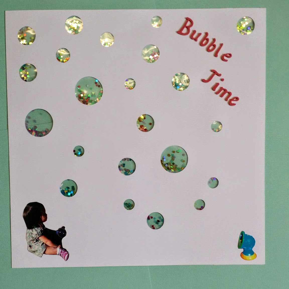
What a great idea!
Look at this design element by Rachelle Keck (now Gianaris!).
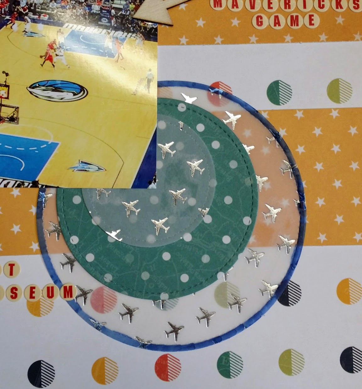
The silver embossed vellum paper is perfect on this page about a trip taken by plane. Here is the full page:
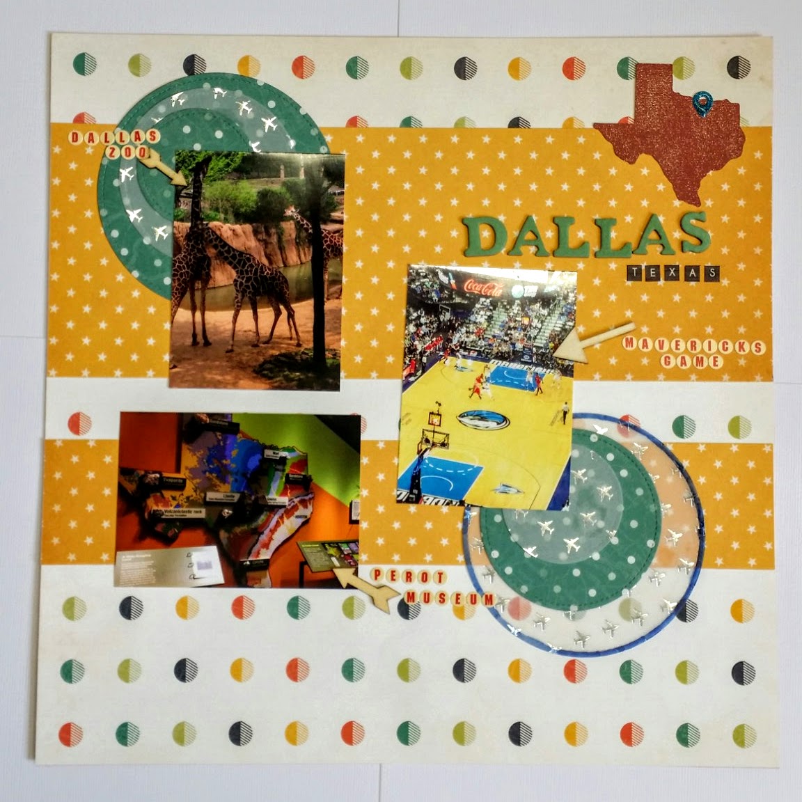
So much color and playful pattern mixing makes for an exciting page!
I love what Hallie Hearnes did with this shaker card!
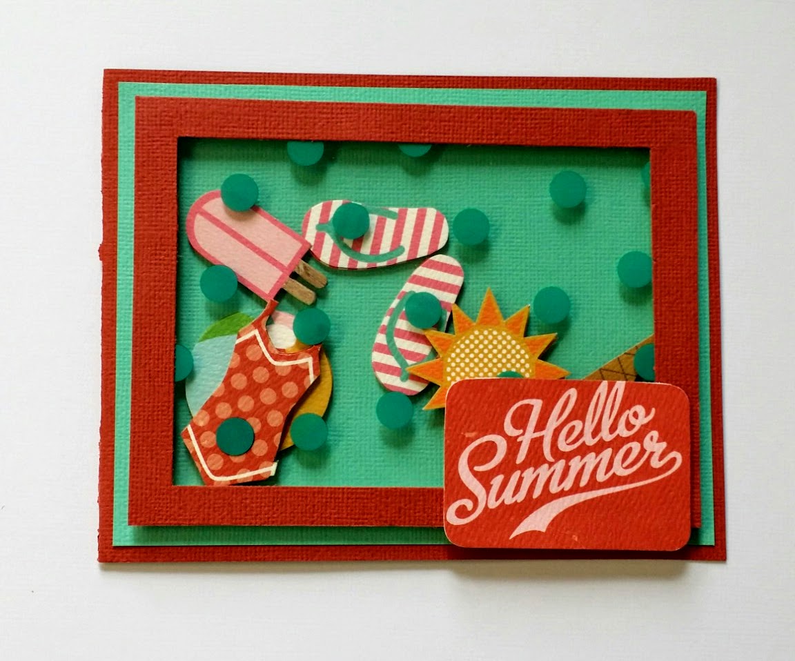
Instead of glitter or beads, she used cut paper pieces. Genius! Her clear piece is the aqua polka dot acetate on the front. I love that it adds to the overall design.
This is also Hallie Hearnes, and the cloud piece is called “Invisibles”. It is a thicker plastic that is translucent.

This piece is a perfect pairing with the hot air balloon.
Isn’t this pretty? Kate Russell used her heat tool and created a little round pocket for glitter on this tag.
Isn’t this pretty? Kate Russell used her heat tool and created a little round pocket for glitter on this tag.
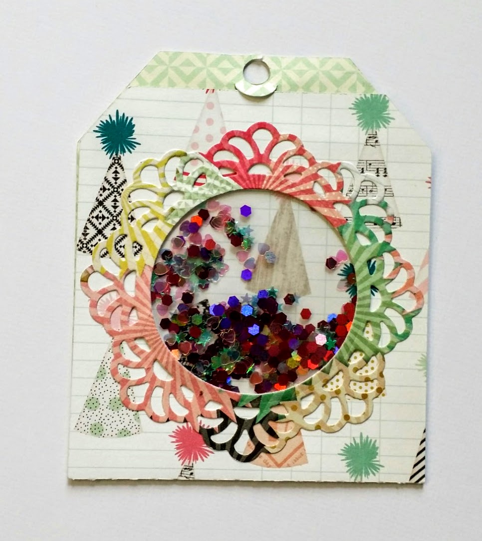
I love that you can see through to the inside of the tag.
Look at this beautiful, gorgeous page! Jan Bintz created a work of art!
Look at this beautiful, gorgeous page! Jan Bintz created a work of art!
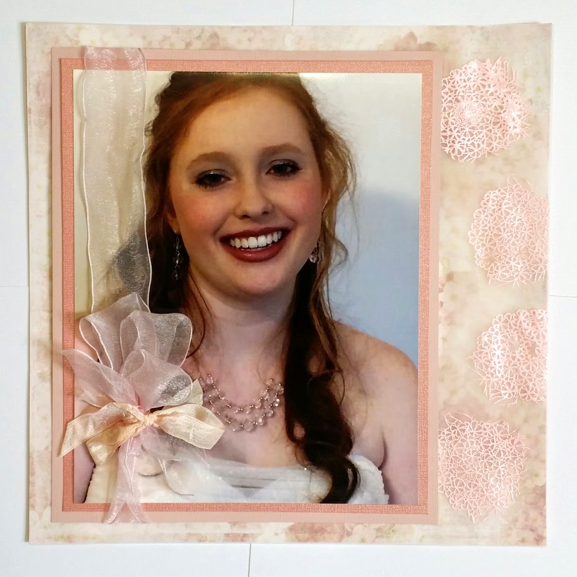
Jan used a 12x12 vellum paper to mute the floral paper and bring softness. The vellum also allows the picture to be the center of attention.
Rachel Steiner had a fabulous idea and painted the back of one of the Bella Blvd. Invisibles so it wouldn’t be translucent.
Rachel Steiner had a fabulous idea and painted the back of one of the Bella Blvd. Invisibles so it wouldn’t be translucent.
But instead of white, like Rachel used, you could paint any color...isn’t that a cool idea! I love that it completely changes the look...and this Invisibles piece is the perfect border.
I used another Invisibles piece...love these multi-color hearts!
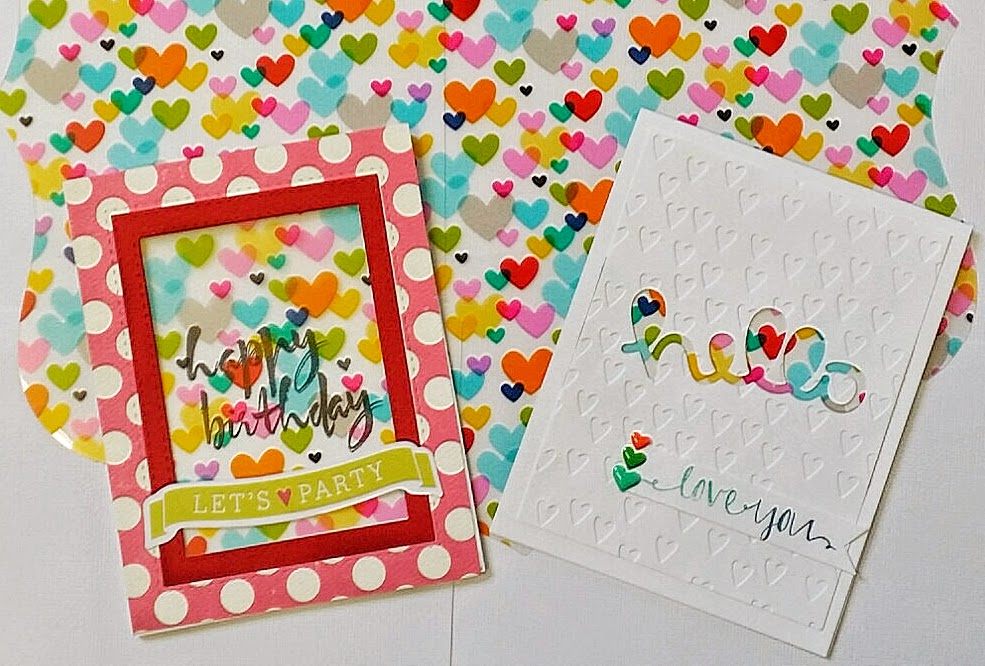
The happy birthday card is a window with the happy birthday actually stamped inside the card and showing thru the hearts piece. The hello card uses the Invisibles piece as a filler for the negative space to add a pop of color.
Margaret Sidenstick made a fancy coffee cup card using beads and clear acetate (did you know that we sell clear acetate by the 8.5x11 sheet?).
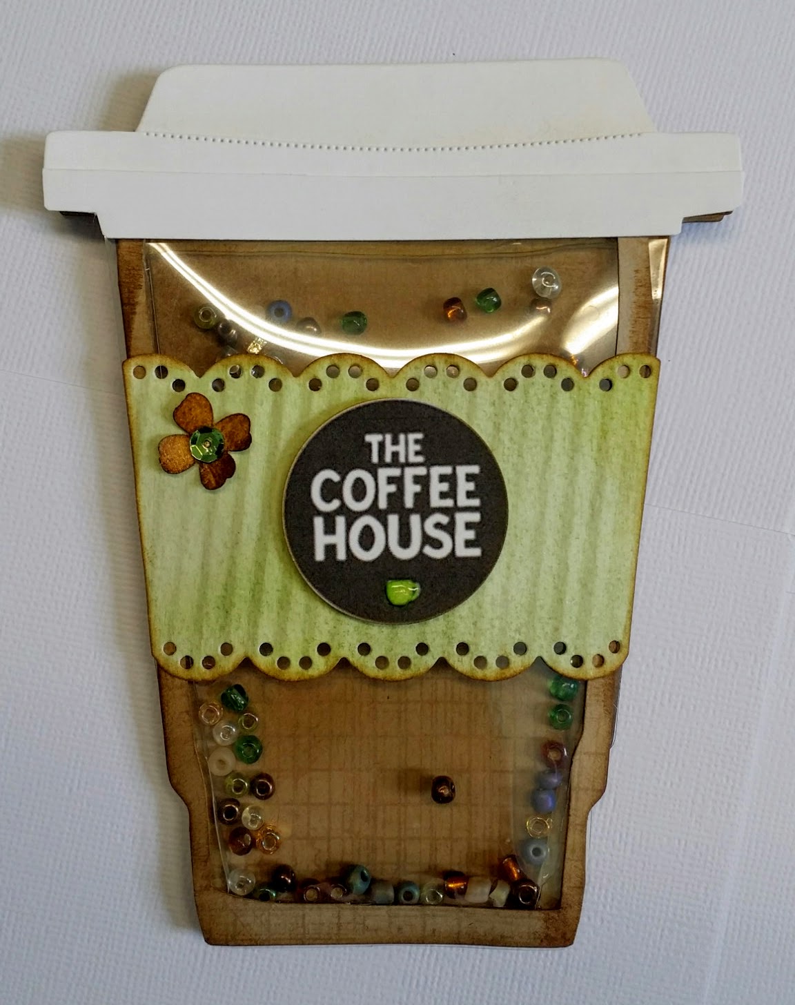
I love all the very specific details she included...the wrap, the lid, even a logo.
This new layout by Rachel Steiner is so clever!
This new layout by Rachel Steiner is so clever!

She cut out this typewriter printed acetate sheet into letters, and to help them really pop off the page, Rachel then traced around each letter. She is one clever scrapper!
Here is a closer look at her work:

That was a lot of information and inspiration! Thank you Design Team for your participation and hard work!
Wait until you see July’s challenge! I have to get to work on my project!
Dixie

Comments
Post a Comment